An interactive Tableau dashboard built on the Committee to Protect Journalists database (1992–2020), exploring a single open-ended question: are journalists in some countries more likely to be killed than imprisoned, and what type of death is most common there? Linked views let a reader move from a global overview down to the story of a single country.
- Context
CS5044 Information Visualisation, MSc Human-Computer Interaction, University of St Andrews.
- Brief
Design and implement an interactive visualisation of a large, unfamiliar dataset in Tableau Desktop. The visualisation had to target an open-ended question across at least four attributes, combine at least two linked views into a dashboard, and go beyond default tooltips with custom interactive elements — all justified through a documented sketching and ideation process.
- Approach
- Question & attributes: I framed the analysis around five attributes — Country, Status (killed vs. imprisoned), Type of Death, Employed As, and Year — enough to compare regions while keeping the story focused.
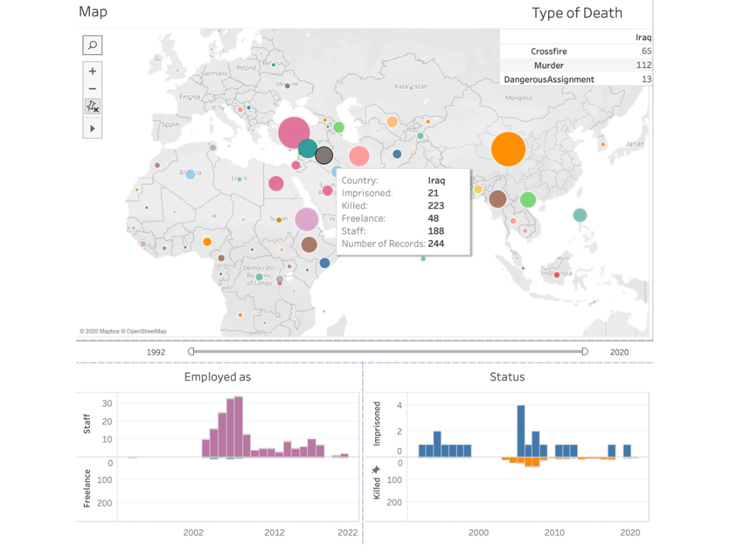
- Multiple views: A world map encodes each country with circle size and colour, two bar charts break down Status and Employment over time, and a floating table surfaces the Type of Death counts for the selected country.
- Visual encoding: Year sits on an ordered x-axis; categorical attributes use hue and the map's position and size channels — choices I evaluated against Munzner's expressiveness and effectiveness principles.
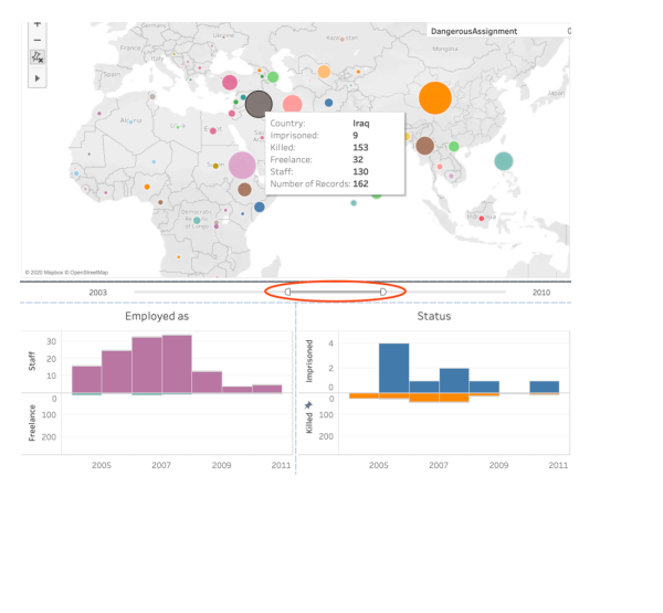
- Interaction: Hovering a country updates the bar charts and table together; clicking greys out other countries for emphasis; and a year-range slider is linked across every view for coordinated, time-scoped exploration.
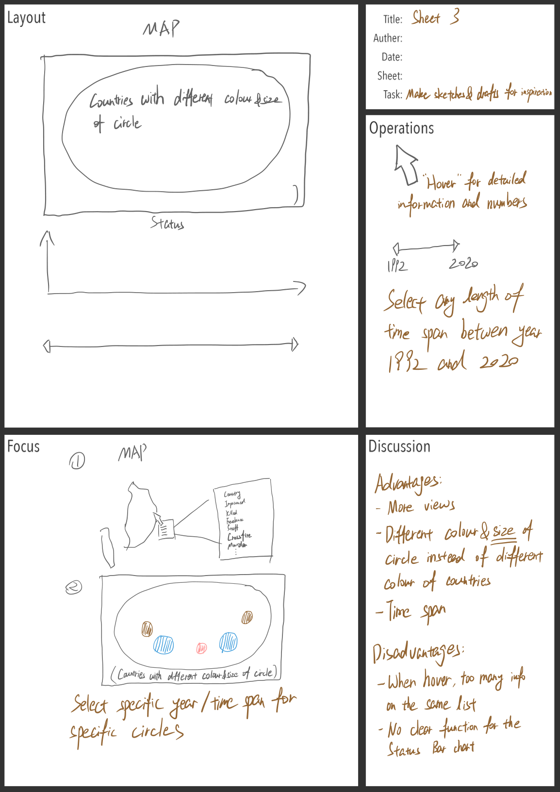
- Ideation: I worked through several fundamentally different concepts using the Five Design Sheet method, weighing each layout's advantages and crowding before committing to the map-plus-linked-charts dashboard.
- Reflection
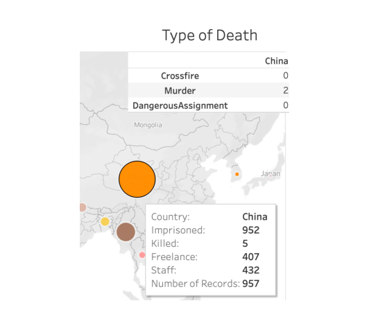
The dashboard surfaced clear contrasts: journalists in Iraq were overwhelmingly killed (223 vs. 21 imprisoned, peaking around the 2003–2011 war), whereas in China they were far more likely to be imprisoned. Pairing overview and detail made these insights discoverable rather than asserted. The main limitation was the fixed bar-chart axis range: small counts became hard to read beside large ones, a reminder that no single encoding is perfect and that the same data invites many valid readings.
- Data SourceCommittee to Protect Journalists — Journalists Killed & Imprisoned Database