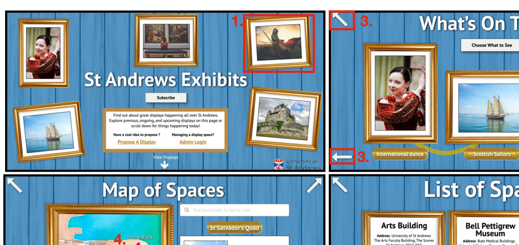
A full user-centred design project for "St Andrews Exhibits" — a concept website that makes it easy to discover what's on display across the University of St Andrews and to navigate the often confusing process of proposing a new display. The work runs the complete design lifecycle, from contextual inquiry through to three distinct high-fidelity prototypes.
- Context
User Centered Design, MSc Human-Computer Interaction · a three-person team project.
- Brief
The university hosts displays in dozens of scattered spaces, each with its own opaque proposal process. It is hard for people to know what's on where, and just as hard for someone with an idea to work out which space is available and who to contact. The challenge was to design a single interface serving three stakeholders — viewers, proposers, and management — that surfaces displays, streamlines proposals, and declutters space administration.
- Approach
- Contextual inquiry: a survey of students plus interviews with management teams and a past proposer grounded the design in real frustrations — e.g. 1 in 5 respondents didn't even know displays existed.
- Modelling & requirements: findings were synthesised into a Work Activity Affinity Diagram, flow and task models for each stakeholder, and a traceable table of system requirements.
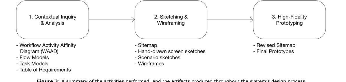
- Sketch to wireframe to hi-fi: each screen progressed from low-fidelity hand sketches through wireframes to interactive high-fidelity prototypes, with client feedback reshaping the sitemap along the way.
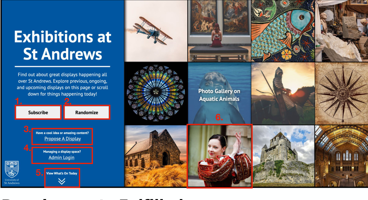
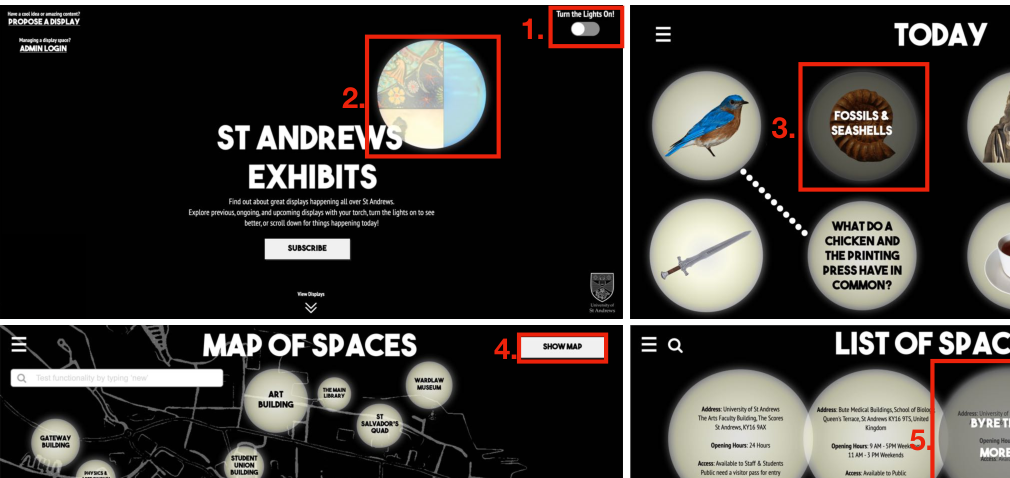
- Three design directions: a clear, image-led Conservative design; a teaser-driven Black & White concept that reveals displays through a roving torch beam; and an Art Gallery design that frames the whole site as a museum to explore.
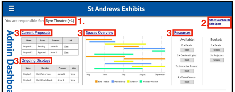
- Management tooling: an admin dashboard with a Gantt overview of displays across spaces, drag-to-book resource management, and at-a-glance analytics.
- Reflection
Comparing the three designs made it clear there is no single best answer — each trades clarity, novelty, and loading cost differently, so the right choice depends on context. Presenting back to the original interviewees produced unanimous agreement that the system would address their pain points. The project also spanned the onset of COVID-19, so the team adapted to running critiques and client reviews entirely remotely — a lesson in collaboration as much as in interaction design.
- Tools
Axure RP (interactive prototyping), contextual inquiry, affinity diagramming, flow & task modelling, wireframing.