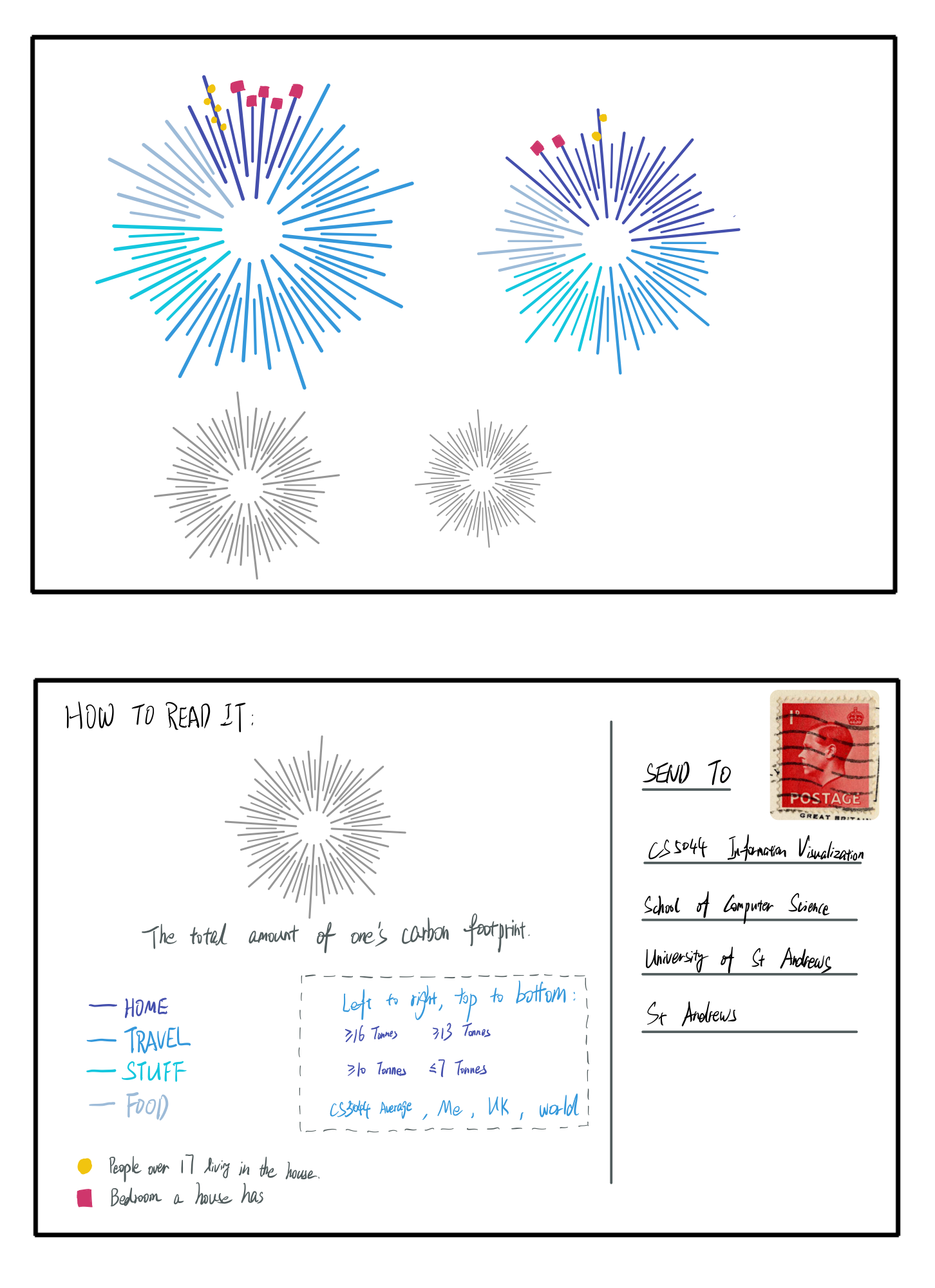
A hand-drawn, "Dear Data"-inspired visualization that turns a year of my personal carbon footprint into a postcard. Rather than reaching for a standard bar or pie chart, the project explores how an evocative, sketch-based visual can communicate both an overview of my emissions and the detail of what drives them, while comparing my data against the world, UK, and class averages.
- Context
CS5044 Information Visualisation, MSc Human-Computer Interaction, University of St Andrews.
- Brief
Get to know the visualization process through sketching personal data. Using the WWF Footprint Calculator and an anonymous class survey, I gathered my own carbon footprint and that of the cohort, then designed a postcard-sized visualization that provides a clear overview of where I stand compared to others and zooms in on the single lifestyle aspect that affects my footprint the most.
- Approach
- Visual metaphor: I designed a fireworks-like radial pattern, similar in spirit to a pie chart but composed of lines of varying length, with colour value encoding the four emission categories (home, travel, stuff, food).
- Overview: Four firework patterns, sized and positioned from large to small, follow the perceptual ordering of our visual system to compare me, the CS5044 average, the UK, and the world.
- Detail: Square and circle marks layer in specifics about the category contributing most to my footprint, adding depth without breaking the overall aesthetic.
- Ideation: I sketched and discarded alternative ideas, including a Tetris-inspired bar layout, before settling on a form that stayed faithful to the concise, evocative Dear Data style.
- Reflection
I evaluated the sketch against Munzner's principles of expressiveness and effectiveness, documenting each attribute, its type, and its visual encoding. The fireworks form is beautiful and proportionally honest, but its dense lines make precise comparison and the addition of further elements difficult. The exercise reshaped how I think about presenting data: the same dataset can be told in strikingly different ways, each with its own trade-offs between aesthetics, readability, and precision.
- ReferenceDear Data — Giorgia Lupi & Stefanie Posavec