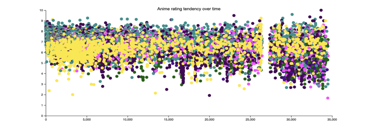
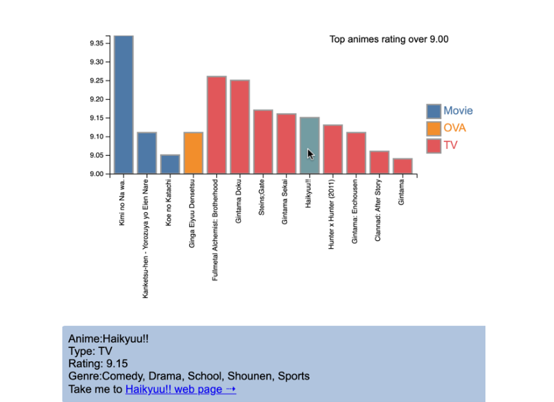
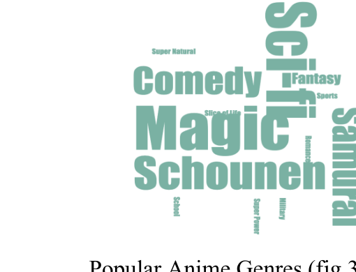
An interactive, D3.js web visualization of the Anime Recommendations Database — 73,516 users' ratings across 12,000+ anime. Three linked views (a scatterplot, a bar chart, and a genre word cloud) work together to answer two questions: how has anime changed over the past two decades, and what do the very best-rated titles have in common?
- Context
Information Visualisation, MSc Human-Computer Interaction
- Brief
Take a large, unfamiliar dataset, derive meaningful questions from it, and build an interactive visualization that lets a reader explore the answers. The dataset had no explicit time field, so a key early insight was that the chronologically-assigned anime_id could stand in as a timeline.
- Approach
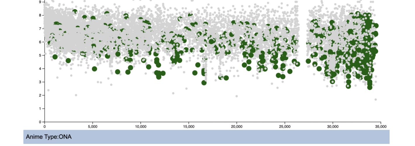
- Scatterplot: anime_id on the x-axis (as a proxy for time) against rating on the y-axis, coloured by type (TV/Movie/OVA/ONA). Hovering a point highlights every anime of that type and greys out the rest, with a tooltip naming the type.
- Bar chart: the top anime rated above 9.0, grouped by type. Hovering a bar reveals a rich tooltip — name, rating, genres — plus a "Take me to" link out to the title's page.
- Word cloud: the genres that recur most among top-rated anime, sized by frequency, giving an at-a-glance sense of what defines a hit.
- Encoding: categorical types use D3's Tableau-10 ordinal palette, chosen over diverging or sequential scales to keep the categories easy to tell apart and read.
- Reflection
The visualizations surfaced patterns invisible in the raw table: OVA — a physical-media format — steadily faded as streaming rose, while ratings grew more polarised as the industry matured and turned commercial. On the coding side, my original plan to split the comma-separated genre column into a new dataset proved beyond my skill at the time, so I pivoted to a hand-seeded word cloud that reshuffles on each refresh — a pragmatic compromise that still added variety. The main limitation was overplotting: even highlighted points get buried in dense regions, which a year-range slider would relieve.
- Data SourceAnime Recommendations Database — Kaggle (Cooper Union)